Ritstjórn
25.7.2025
Have you ever wondered where the name Miðeind and our logo come from? In this article, you'll get the answers!
First, a bit of physics: The entire material world is composed of matter and energy, and the smallest distinguishable units of each are particles. There are, among others, leptons, baryons - and mesons. The best-known lepton is the electron, while protons and neutrons — which form the nucleus of atoms — are baryons. However, mesons are not generally well-known, as they live for an extremely short time: less than one nanosecond (one billionth of a second). Nevertheless, they play their role and have various interesting properties.
The founder of Miðeind, Vilhjálmur Þorsteinsson, is the son of the late Þorsteinn Vilhjálmsson, who was a professor of physics, and Vilhjálmur once participated in the International Physics Olympiad on behalf of Iceland. It was therefore natural for Vilhjálmur to look to physics when it came to finding a name for the company - and he thought Miðeind (Icelandic for meson, literally "central particle") sounded good, at least better than Létteind (lepton, "light particle") or Þungeind (baryon, "heavy particle").
Initially, Miðeind used a logo that Vilhjálmur designed himself and looked like this:
As the company grew, the time came to think carefully and with a long-term perspective about its branding strategy, image, and appearance. The approach taken – as with many things Miðeind does – was to ensure high quality work even though it might require more cost and effort initially, ending up with a result that could stand the test of time.
Three design and branding agencies were approached for proposals on how to approach Miðeind's branding, which were paid for. After review and comparison, it became clear that the design studio Peel stood out, and was subsequently tasked with the design of the logo and graphic identity of Miðeind.
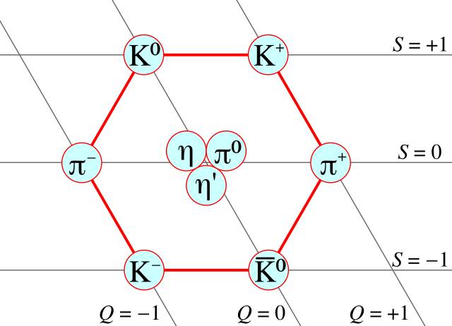
Among the things that caught the eye of the designers at Peel was an explanatory image in the Wikipedia article about the various types of mesons and how they are interconnected:
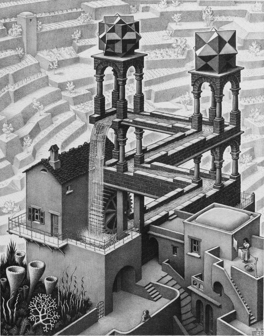
Another topic that came up in discussion with the designers as an interesting source of ideas was the book Gödel, Escher, Bach: an Eternal Golden Braid by Douglas Hofstadter. This book connects mathematics, music, and visual art, especially works of the Dutch artist M.C. Escher:
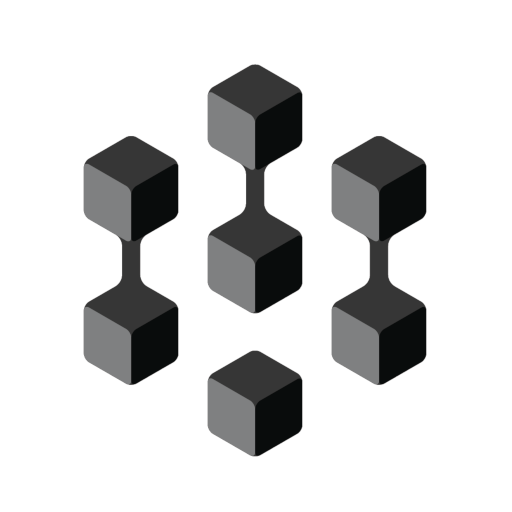
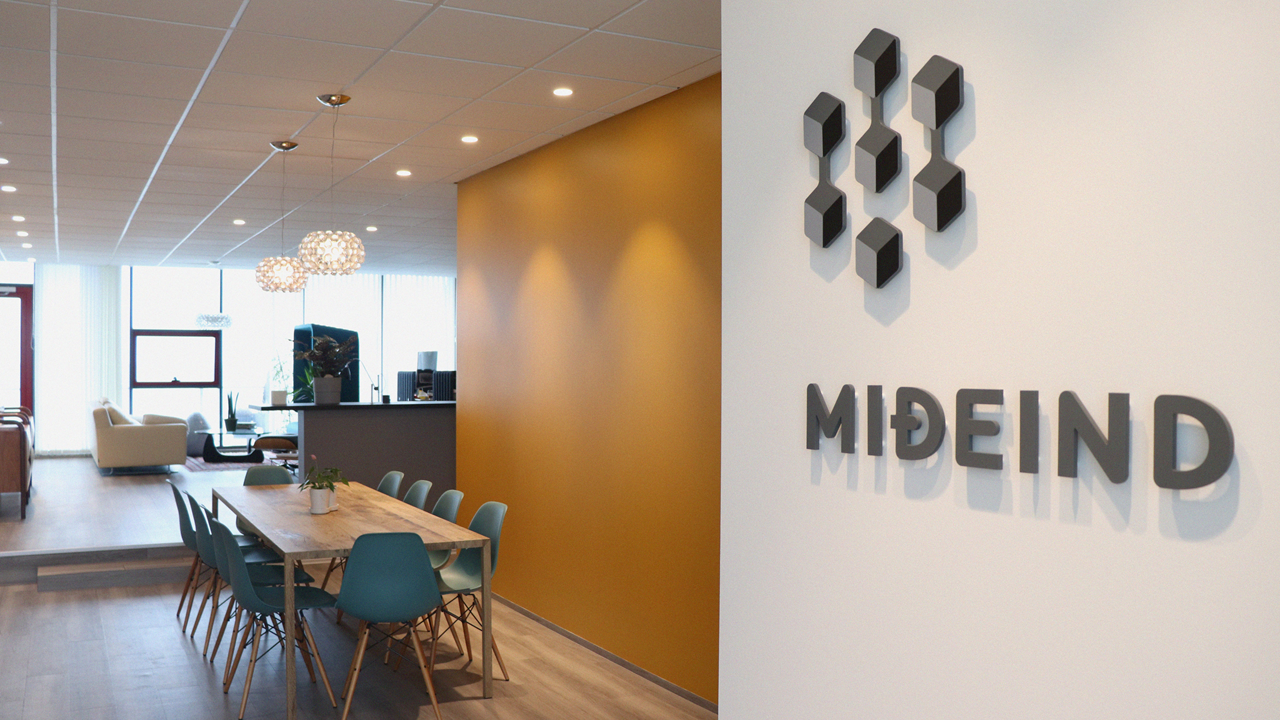
When the aforementioned hexagon of the mesons, M.C. Escher's "impossible" three-dimensional drawings, and the letter M came together in the designers' minds, the result was what we now know:
The logo consists of seven cubes connected by three "bridges" in the style of Escher, and it's possible to see the letter M in the pattern. The logo catches the eye partly because it suggests a three-dimensional space, which is, however, ambiguous and defies reality, much like Escher's designs. Furthermore, the logo is simple and strong - and, as we will see later, it allows for various variations and playful interpretations.
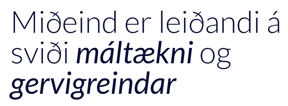
When it came to the typeface for the company name MIÐEIND, the chosen font was Locator Display Bold by designer Eric Olson. The typeface is clear and concise, but not common, thus creating a certain uniqueness. It combines curves and angles alternately in an interesting way, which could, for example, be evocative of the interplay between natural and social sciences, art and mathematics, the digital and the analog.
With the standard Locator typeface "off the shelf", the name of Miðeind would look like this:
However, the name in our logo looks like this:
Apart from the slightly wider spacing between the letters, the main difference lies in the stroke of the Ð (did you notice that?). Peel modified the stroke, making it more attractive, wider, and rounded the right edge so that it would blend better with the D-shape. Yes, attention was paid to the details!
It was previously mentioned that the Miðeind logo offers various variations - and since it's in grayscale, it's easy to use colors with it. The approach was taken that Miðeind's products would get their own logos based on the same core concept as the company logo. Let's take the voice assistant app Embla as an example:
Here, the seven cubes are connected by six Escher bridges forming the letter "e" - for Embla.
It was decided to use the font Lato by Łukasz Dziedzic for all published text on behalf of Miðeind, including this text you are reading now. Lato is a professional, clean, and highly versatile font that is available in many weights and variations. It combines being easily readable in regular text and offering various possibilities in headings and supplementary content:
The latest brand extension of Miðeind can be seen in the logo of Málstaður, which is a common platform for most of our products - and each of them has its representative in the multicolored cubes of the logo:
We at Miðeind are very pleased with our branding and how successful the development of the company's graphic identity has been, with great help from the wizards at Peel. We hope that the image aligns with the experience of customers and the public that the company is progressive, professional, and trustworthy.
Image Rights Holders:
Picture 2: Wikipedia, User:E2m, User:Stannered - Image:Noneto mesônico de spin 0.png
Picture 3: © 2014 The M.C. Escher Company / mcescher.com